Vocabloom
UI/UX Design Case Study - Language Learning Vocabulary App Project
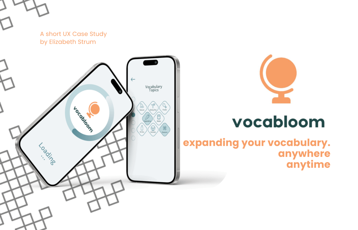
The Challenge
Making new vocabulary learning a pleasant and intuitive experience that can be easily accessed on the go
The Actions
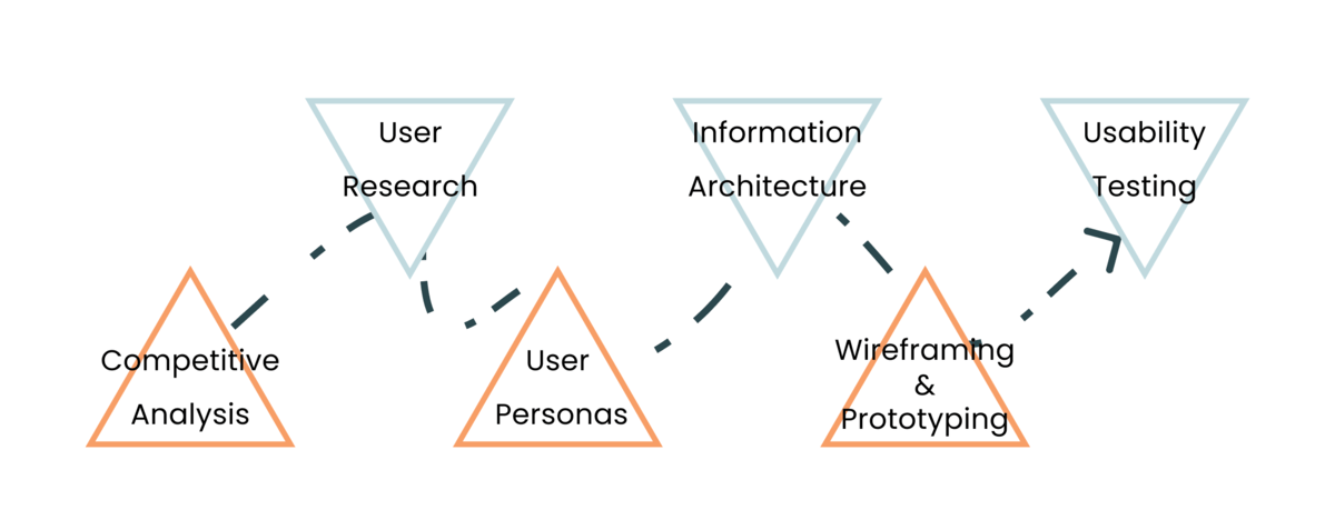
The creation of Vocabloom involved a comprehensive UX process, beginning with user research and user persona development to identify user needs and pain points. The project progressed through wireframing and prototyping, incorporating iterative feedback from usability testing to refine the design. Finally, the app was developed with a focus on intuitive UI and seamless user experience, ensuring effective vocabulary learning on the go.
The Goal
To create a modern, app-based solution that allows users to learn new vocabulary efficiently and conveniently on the go
Skills and Technologies Used
- UI/UX Design
- Competitor Analysis
- User Research
- Usability Testing
- Wireframing and Prototyping

Case Study Process
The case study process for Aptice, an innovative online platform responsive web app connecting users with beauty experts for virtual consultations, was meticulously crafted over a span of 5 months. Beginning with comprehensive user research, I delved into understanding user needs, market trends, and competitor analysis to establish a solid foundation. This research phase informed the development of user personas and journey maps, guiding the subsequent design process.
Competitive Analysis
Four apps were analyzed: Duolingo, WordUp, Flashcards World, DuoCards

- Usability and Tutorial Support: All four apps are user-friendly with straightforward designs. Three include tutorials for better onboarding, but Flashcards World lacks this feature, making it less accessible for new users.
- Desirability and Brand Identity: Flashcards World and DuoCards lack a memorable brand identity and appear bland. Flashcards World especially feels basic, lacking emotional engagement, which needs improvement for better user appeal.
- Findability and Icon Recognition: All apps are easy to navigate, but Duolingo's unique icons can be hard to recognize, hindering navigation. A balance between uniqueness and recognizability is crucial for better user experience.
- Credibility and Customization: Each app is credible and meets specific language learning needs. They offer social features and customizable experiences, ensuring users feel valued and not subjected to a generic approach.
User Interviews
Three users were interviewed, using Zoom and in-person interviews
- Samineh
- I learn whenever I can and make sure to dedicate a minimum of 15 minutes per day.
- I think that it is important that the app provides real-life usage and activates your new vocabulary.
- I feel competitive and motivated to learn more due to the gamification element in the app and the leaderboard.
- Geraldine
- I tend to learn by experiencing the foreign country directly and learning the language in real-life.
- I think that people learn best and enjoy the app most when there is a game element involved.
- I feel frustrated when the vocabulary app I am using is teaching me words that I are not usable in daily life.
- Phillip
- I am using vocabulary apps in addition to my language classes, whenever I have free time.
- I think that being able to use new words in a conversation is the best marker of success.
- I feel bored when the vocabulary learning process is not interactive and engaging.
User Persona
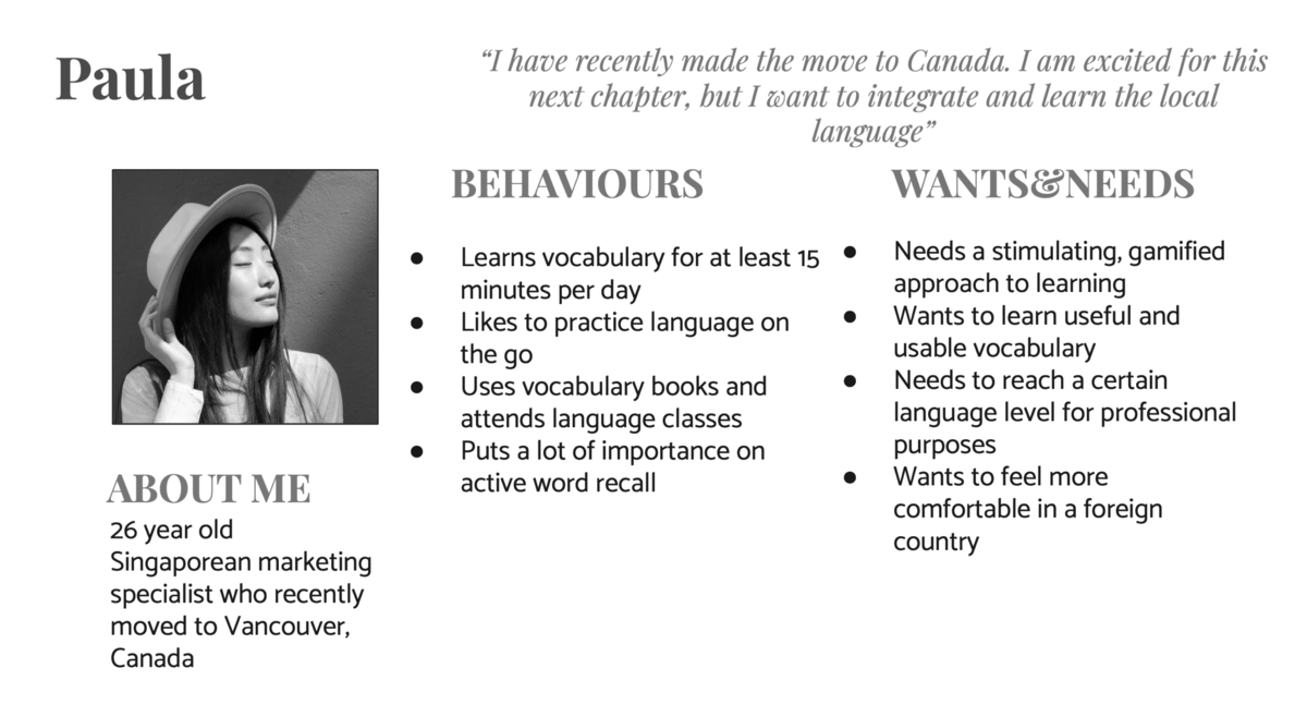
Based on the User Interviews, a User Persona called Paula was created.
The Problem Statement
How might we design a mobile app that allows people to learn new vocabulary effectively and consistently?
Objective
Empowering people to learn new vocabulary.
Information Architecture
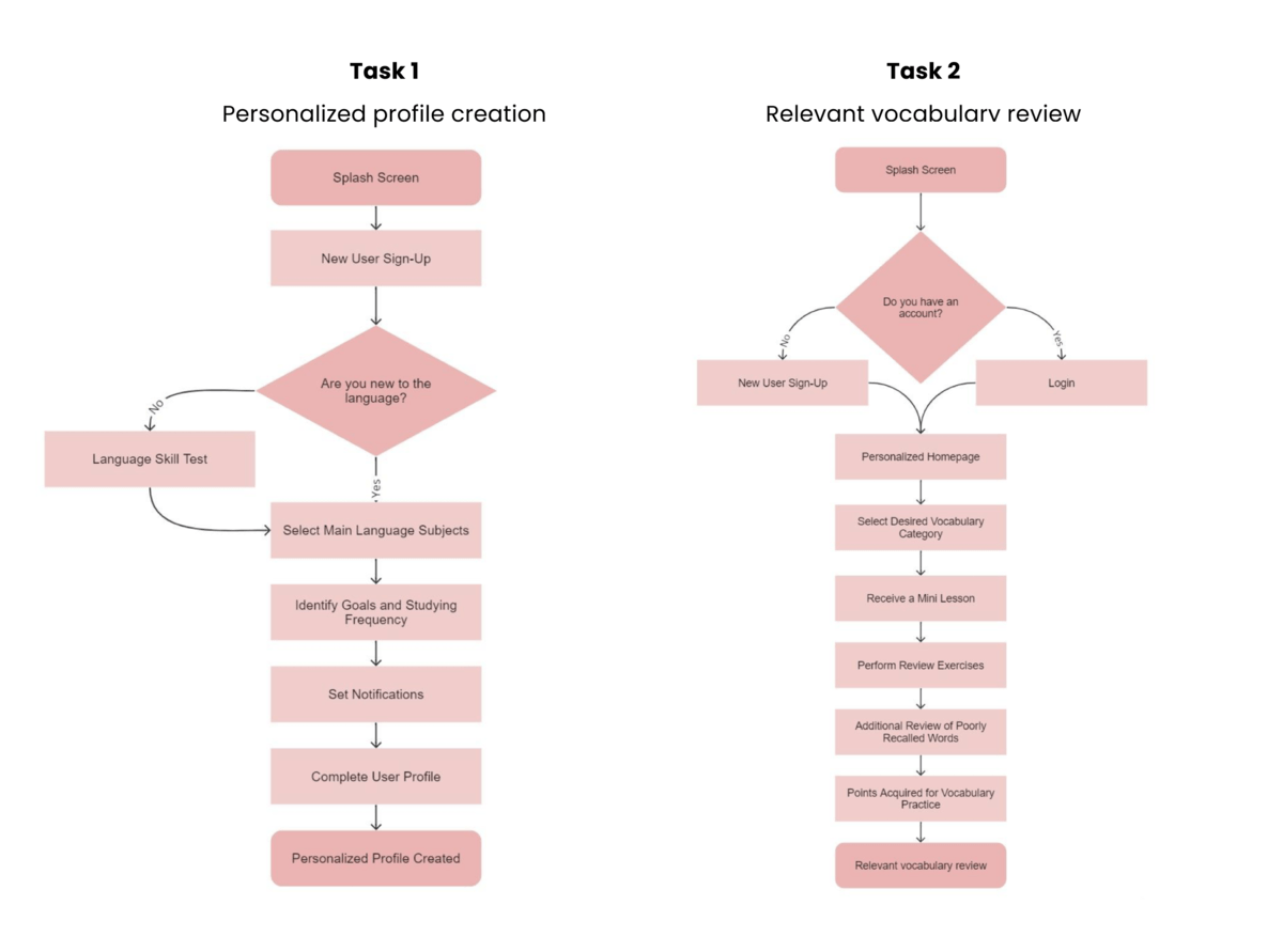
Based on the key functions of the app, the optimal information architecture was constructed.
Initial Wireframes
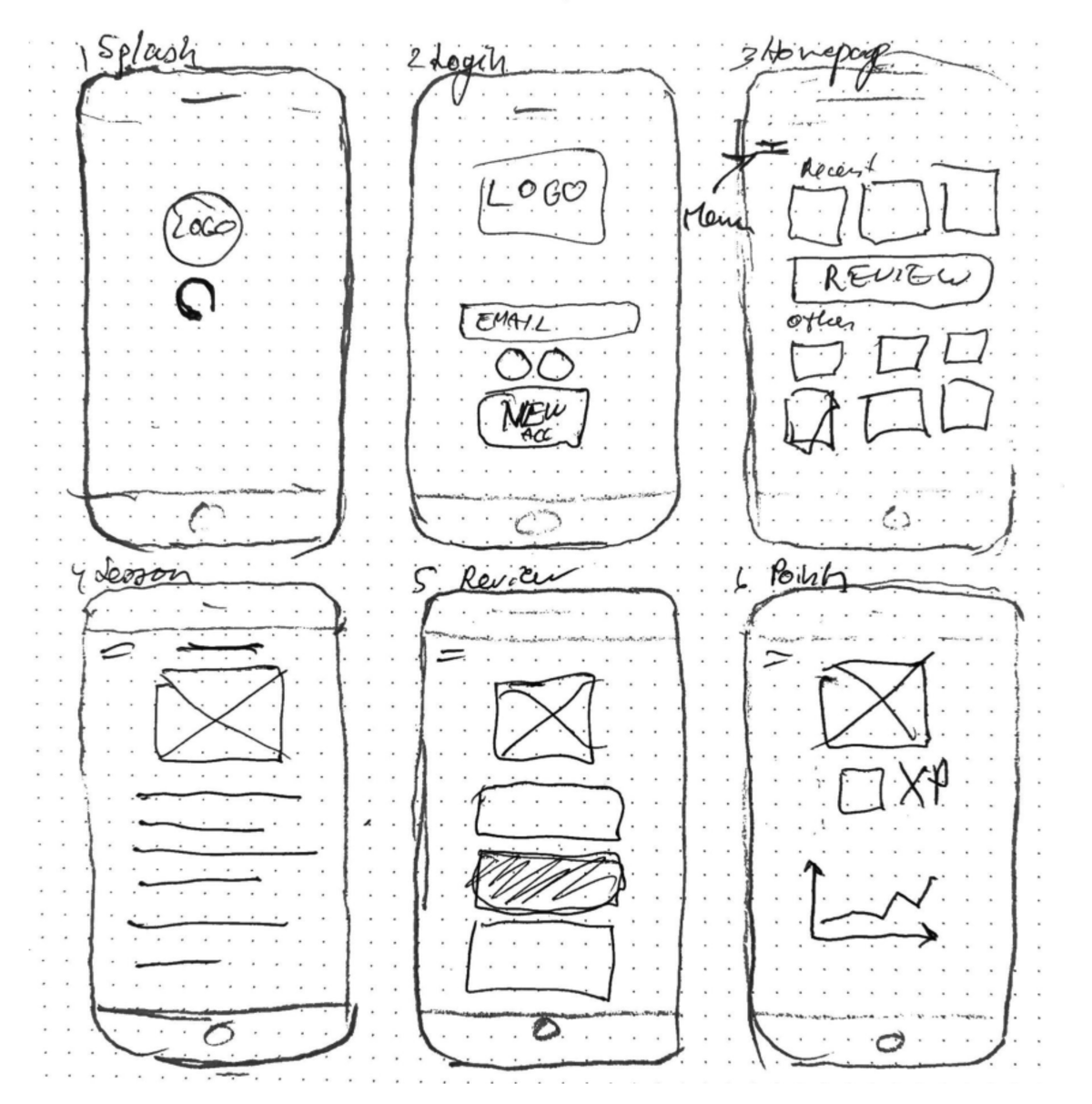
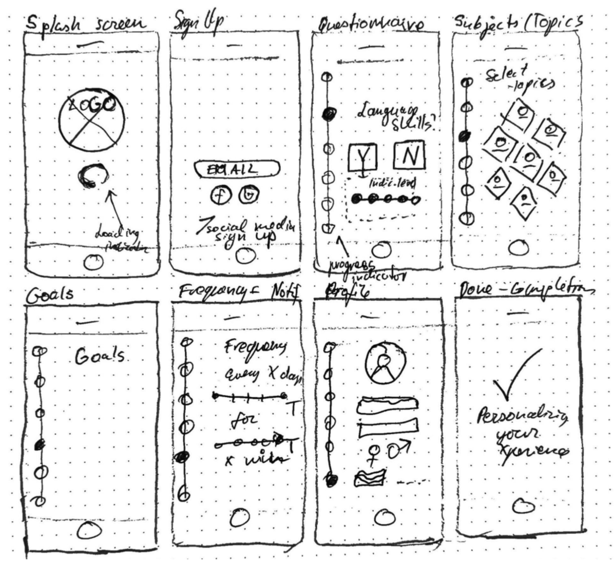
Using pen and paper, initial wireframes were created, which were later translated into low-fidelity prototypes.
Usability Testing
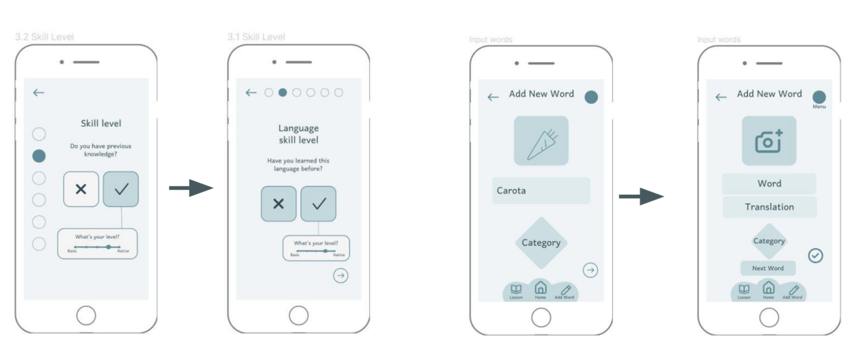
After the Usability Testing, the following areas for improvement were discovered:
- Onboarding
- Lesson Navigation
- Vocabulary Review
- New Word Addition
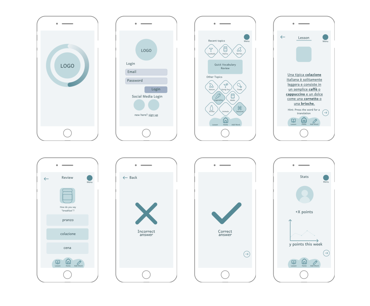
Final Wireframes
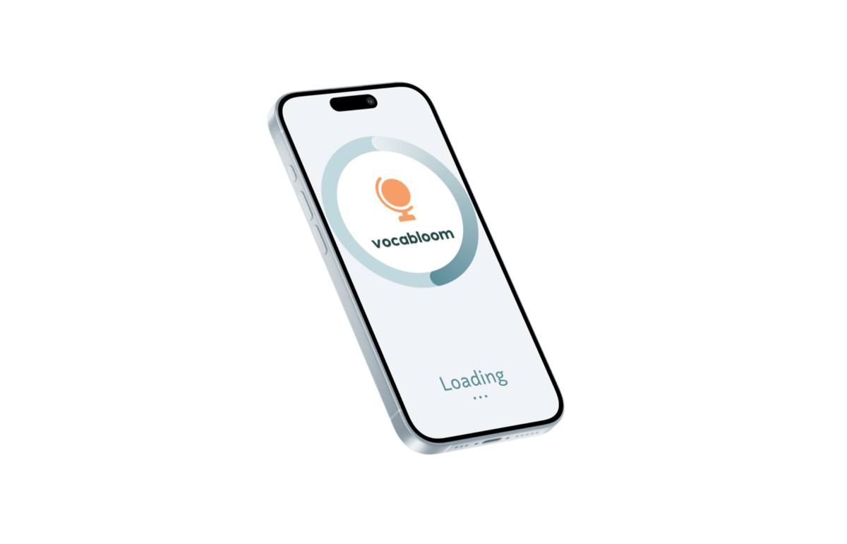
As this was a short project, only mid-fidelity prototypes were produced, featuring all of the basic user flows and intended app functions.
Every phase of the journey, from the initial idea to the final execution, was rooted in user-centered design principles and driven by a passion for delivering a transformative digital experience in the beauty industry.
Challenges
The main challenge in this project was to create a unique product in an oversaturated market, whilst still maintaining the intuitive nature of the product. In addition to that, user testing has shown that certain features, such as the vocabulary selection, still need to be improved, in order to achieve the best user experience possible.
Future Steps
Continuous user testing will ensure the ongoing improvement of the User Experience in the application, allowing optimization of the interface for a wide variety of users, making sure to focus on accessibility, to include all user groups. Additionally, for the product to be released, there is a need for enhancing desirability and brand identity. This would include focusing on marketing, branding, and a memorable UI.